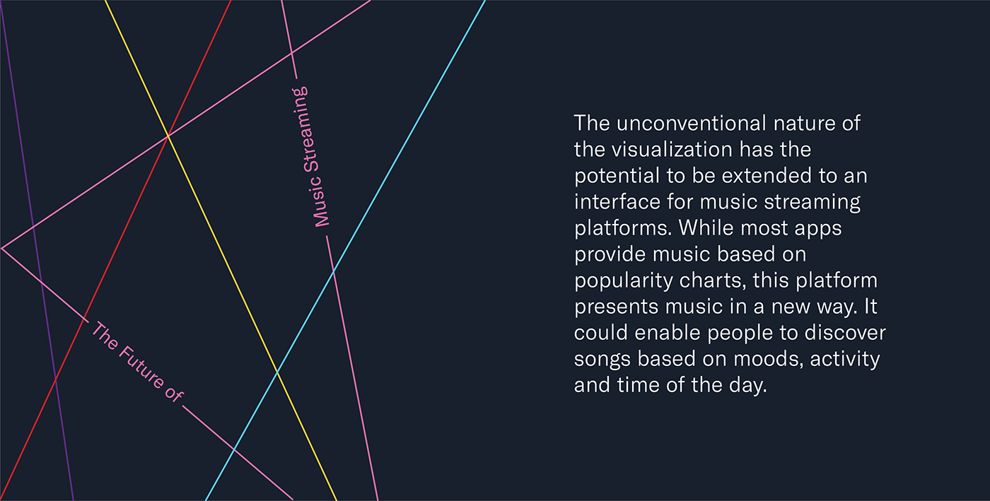
The National Institute of Design brings students from different parts of the country and diverse cultural backgrounds together. This gives rise to a variety of music preferences under one roof. Tune attempts to plot the dynamic between music and its listeners.
Done over the duration of a week, this group project involved collecting data, exploring suitable visual representations and finally creating a mapping that represents the correlation between the parameters. Two interactive visualisations were created as a result of recording the songs, genres, associated moods, spaces and the corresponding activities of the respondents.


Explorations of visual representations went through a series of iterations and discussions.
The 4 Axis Graph
This representation addresses the first inquiry. To make connections within the different parameters, we created a four-point plot graph with parameters on each side and colours to match genres. Each quadrilateral represents a single respondent and their data.
In the visualisation below, the genres are interactive. Click on the genres to view the trends and correlations. 'How to Read' or the '?' in the view menu provides a quick guide to understanding the graph.


Close-ups highlighting the details within the lines.
The Accordion Graph
The second representation looked at making this data collected accessible to everyone by reducing the number of parameters. Moods were marked on one side while spaces were marked on the other. Colour denoted the genres of the songs.
Time was divided into two—morning (6am—6pm) and evening (6pm—6am). Though this was plotted visually with the use of the upper or lower waves, we used viewpoint as another parameter. By creating an accordion fold, one can see all the morning songs from one position and the evening songs from the other.
In the representation below, click on the icons in the view menu to toggle between different views. Since the visualisation was intended for print, the sizes have been scaled down for digital viewing.


Close-ups highlighting the song detail on the curves.


A visualisation of the graph installed in a space viewed from the left, and a test print viewed from the right.